Typography & Visual Hierarchy
Speak volumes without saying a word—master the art of type and layout.
Typography is more than just choosing fonts—it’s about communicating effectively through text and structure. In this course, you’ll dive deep into the world of letterforms and learn how to guide a viewer’s eye using visual hierarchy. Understand how to organize content, build clarity, and create compelling designs that grab attention and leave a lasting impression.
What You’ll Learn / What’s Included:
-
Typography Foundations
Learn the anatomy of type, font classifications, and how to choose the right typefaces for your brand or product. -
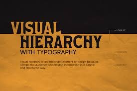
Hierarchy & Readability
Discover how to guide the viewer’s eye using size, weight, spacing, contrast, and alignment. -
Pairing Fonts Effectively
Tips and techniques for creating balanced, aesthetically pleasing font pairings. -
Responsive Typography
Best practices for scalable, legible typography across devices and screen sizes. -
Grids & Layout Systems
Structure content with clarity using grid-based systems to maintain visual flow and consistency. -
Practical Application
Work on real-world examples such as landing pages, mobile UIs, posters, and editorial layouts to apply your learning.
Why It Matters:
Good typography doesn’t just look nice — it speaks, influences, and converts. Combined with strong visual hierarchy, it ensures your message is understood exactly how you intend, boosting both user experience and brand perception.
Perfect For:
-
UI/UX and graphic designers
-
Frontend developers
-
Branding professionals
-
Content creators and marketers


Reviews
There are no reviews yet.